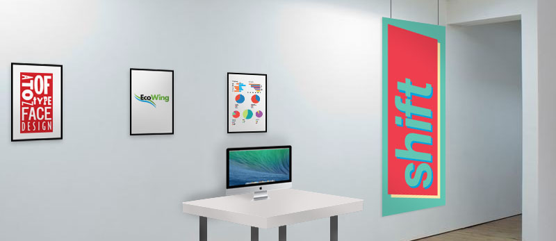
Shift
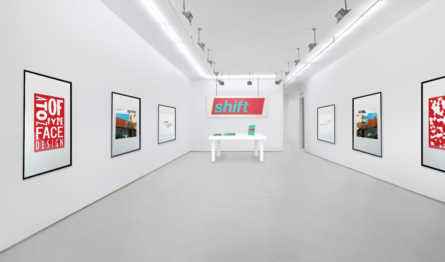
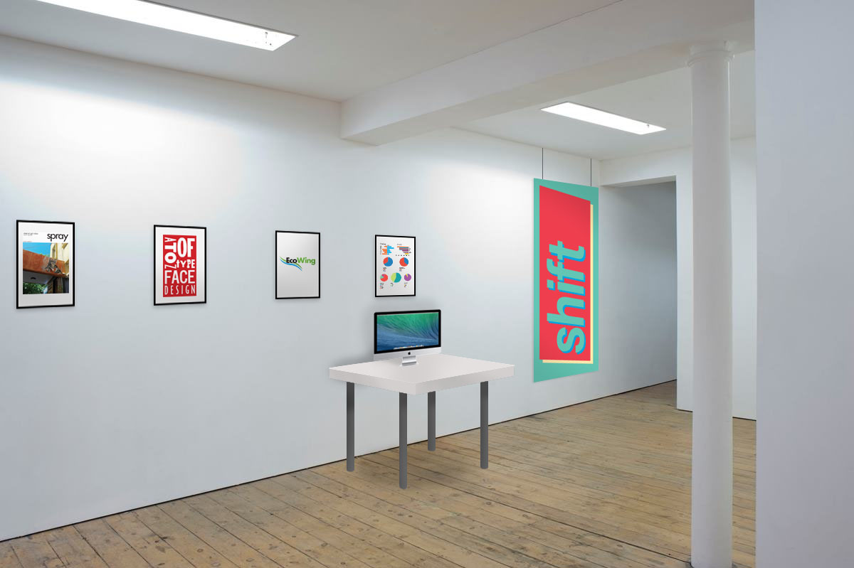
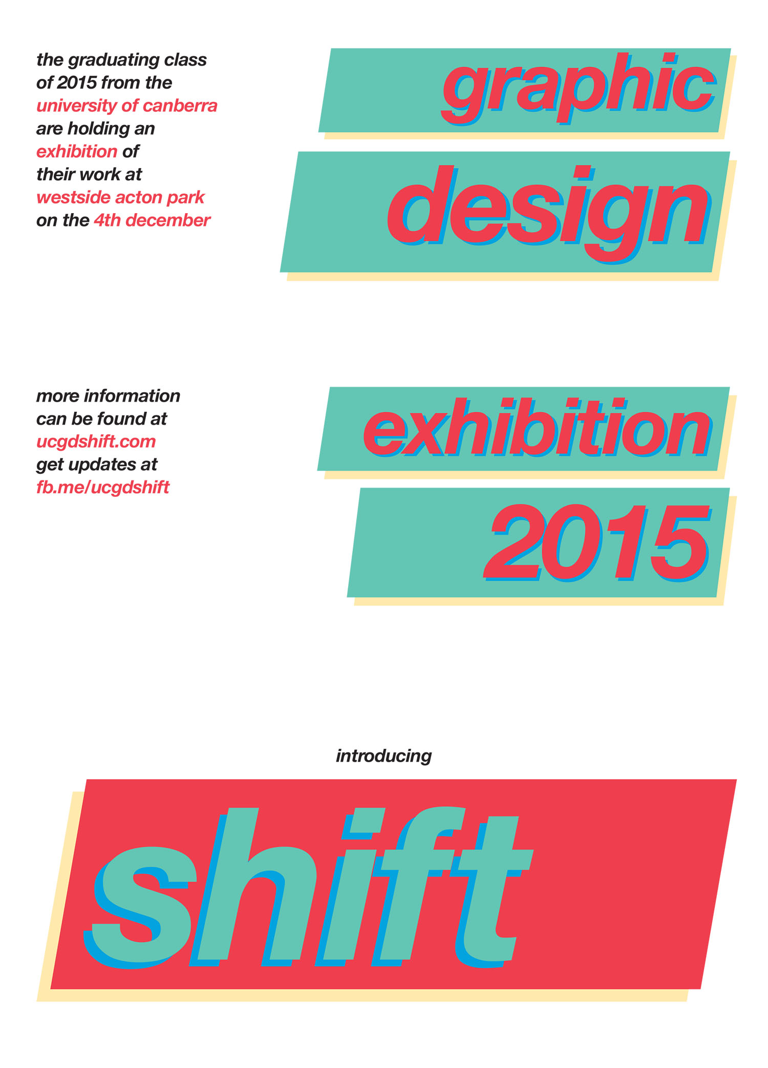
My solution for the exhibition is named Shift. The branding and design of the collateral is based on the same shapes and colours, and is fairly minimal. This helped to give focus to the art on display, and kept the branding itself as a secondary feature of the exhibition. In researching this project, I gained further exposure to other exhibitions and projects and the many unique and creative methods of display that the teams had executed.

